INSTAGRAM GRID STYLING | Sonia Gonzalez Bsocial Communications
Three Steps to Styling your Instagram Grid
When you have someone visit your business Instagram account, what do you want them to see? Want them to notice your personality, a strong brand voice and an overarching visual story? If so, a consistent and structured Instagram grid can help strike interest and even motivate someone to follow your account.
Just like your written content, each piece of visual content plays into a larger strategy. Here are three steps to creating your Instagram visual strategy:
1. Choose a grid layout
When you begin to think about your Instagram style strategy, start by choosing how you want to lay out your photos. An Instagram grid layout is essentially how each post is positioned in your feed and is built on a structured design.
The layout can be simply posting all square photos with the same theme and filter (next step), or you can structure your page with unique elements like borders, create tile patterns like a checkerboard or post similar photos in a group of three to build a storyline. Regardless of the layout you choose, the key is to stick with it and be consistent.
2. Choose a photo theme and filter
Once you have a layout in mind, it’s time to pick your instagram photo theme. Do you want your page to be all light photos or have a dark and moody feel? Do you want all your photos to have a vintage feel or want all your photos to be in black and white? When picking a theme be sure to go with one that represents you and your brand. If you’re bold and bright, have your photos reflect that. If you want something easy to maintain and more on the conservative side, maybe a white and grey look is more your style.
Once you pick your theme, photo filter and lighting style be sure to stick with it. Consistency is key! If there are photos and videos you would like to post but they don’t go with the flow of your grid, place them in your story. They will still gain exposure and engagement.
3. Have a content plan
The type of content you post and how the photos are placed will add to the flow and visual appeal of your page. Consistency comes with content planning. Create a brief outline of what you want to post ahead of time (it can even be three weeks at a time). Next, take the photos you need based on that plan so you have a database of photos to pull from.
This will ensure consistency in your photos and content and will help avoid the inevitable panic for looking for something to post.
Examples of accounts rocking the grid game
Here are five professional Instagram grid styles mastered by local boss babes that will be sure to inspire you to find your own visual voice!
Account: @velvetcrane
Grid layout: Checkerboard
Theme: muted, natural colour palette
Content: natural beauty line promoting self-love and honest beauty
Account: @choicesandvoicesbirth
Grid layout: vertical lines
Theme: black and white with a splash of colour
Content: birthing education and empowering women
Account: @mushroomsandthyme
Grid layout: traditional squares
Theme: dark, moody feels
Content: food sharing and styling
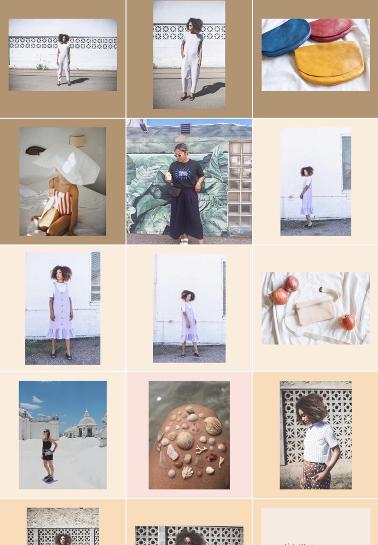
Account: @shopnor
Grid layout: coloured borders
Theme: muted, natural colour palette
Content: vintage and handmade apparel, sustainable fashion
Looking for some guidance on how to create a professional and eye-catching Instagram page? bSocial Communications creates customized and easy to follow Instagram style strategies that you can implement yourself. Learn more about bSocial Communications at www.bsocial.ca or @bsocialcomm.


